Space Bites started the way the best food businesses do — from a kitchen, a passion, and a growing group of people who couldn't stop ordering. After building a loyal following through word of mouth, the founder was ready to take her homemade brownie business from passion project to proper brand. She needed an identity that honoured where she came from while feeling ready for where she was going.
The name "Space Bites" opens up a whole universe — literally. The brief called for something playful and memorable that could grow with the brand, appeal to a wide audience, and still feel handcrafted rather than corporate. The challenge was making "space" feel warm and approachable rather than cold and scientific — because at its heart, this is still a brand built on the pleasure of really good brownies.
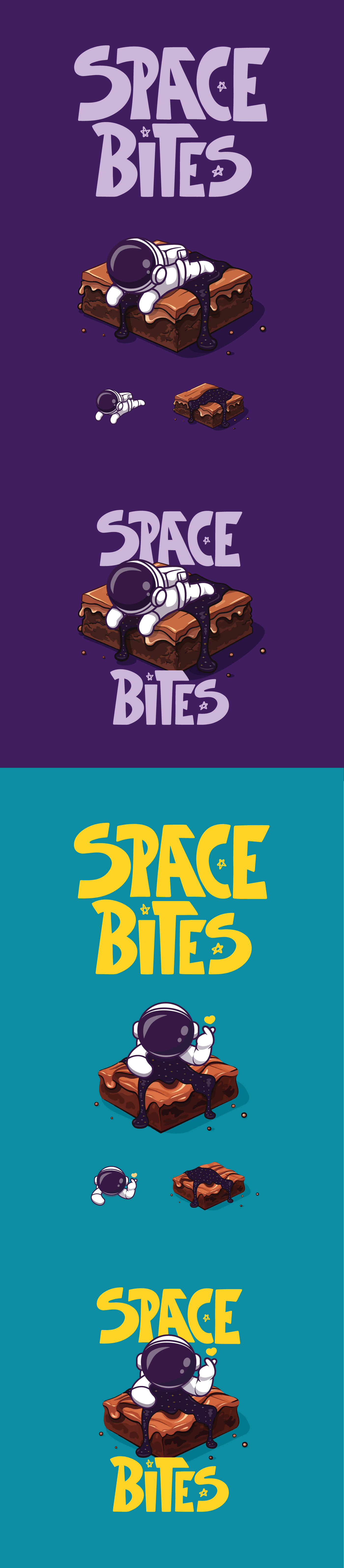
The logo leans into the cosmic playfulness of the name while keeping the warmth of a homemade product at its centre. The result is a mark that feels like it belongs on a craft brownie box as much as it does on an Instagram grid.
The final logo gave Space Bites a visual identity ready to carry across packaging, social media, and all the places a growing food brand needs to show up. A small business that started in a home kitchen now has a brand that looks the part. Her business is growing and I'm on retainer to build her brand with her.